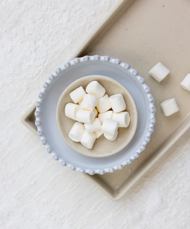
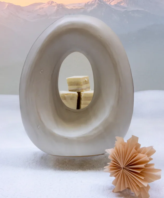
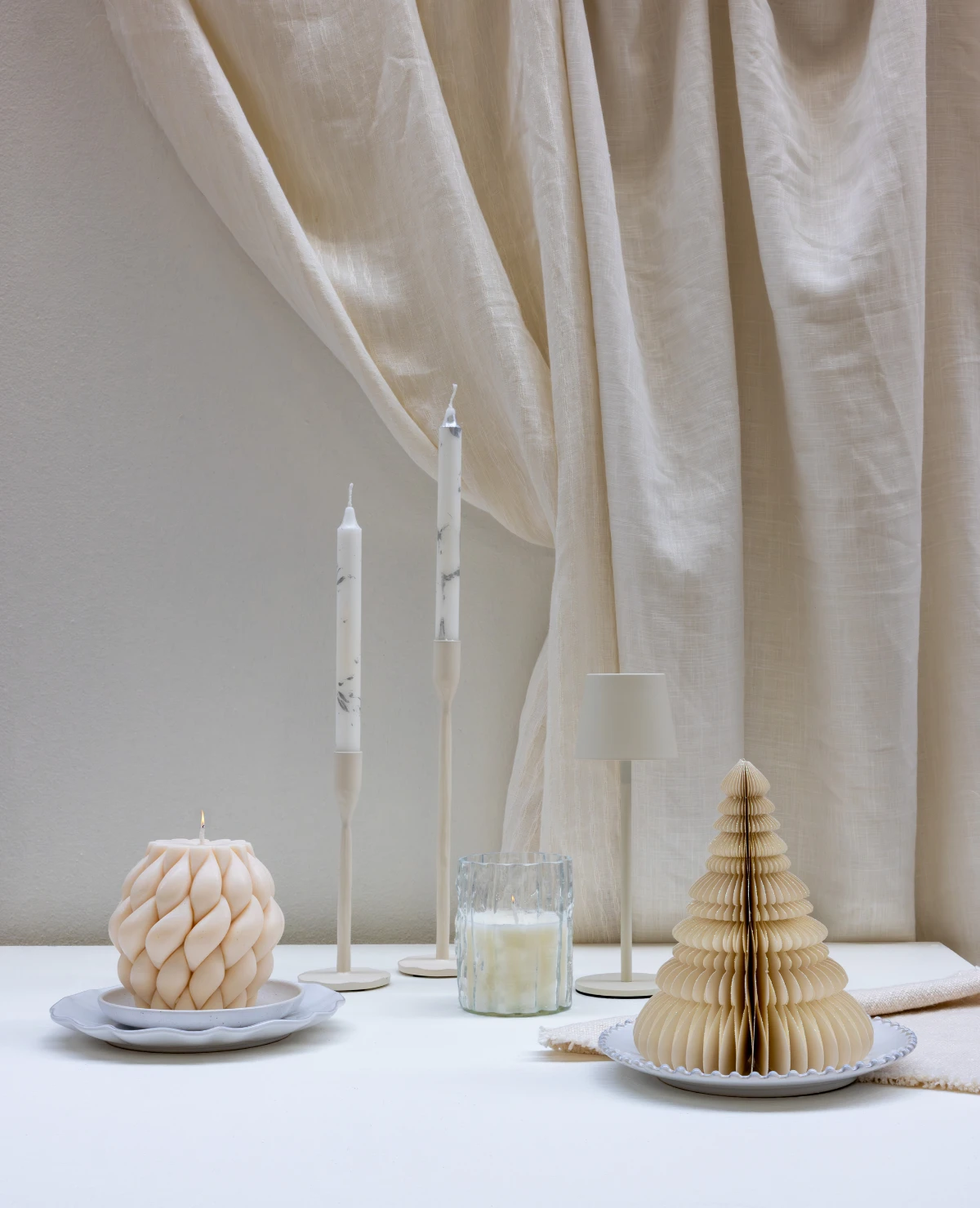
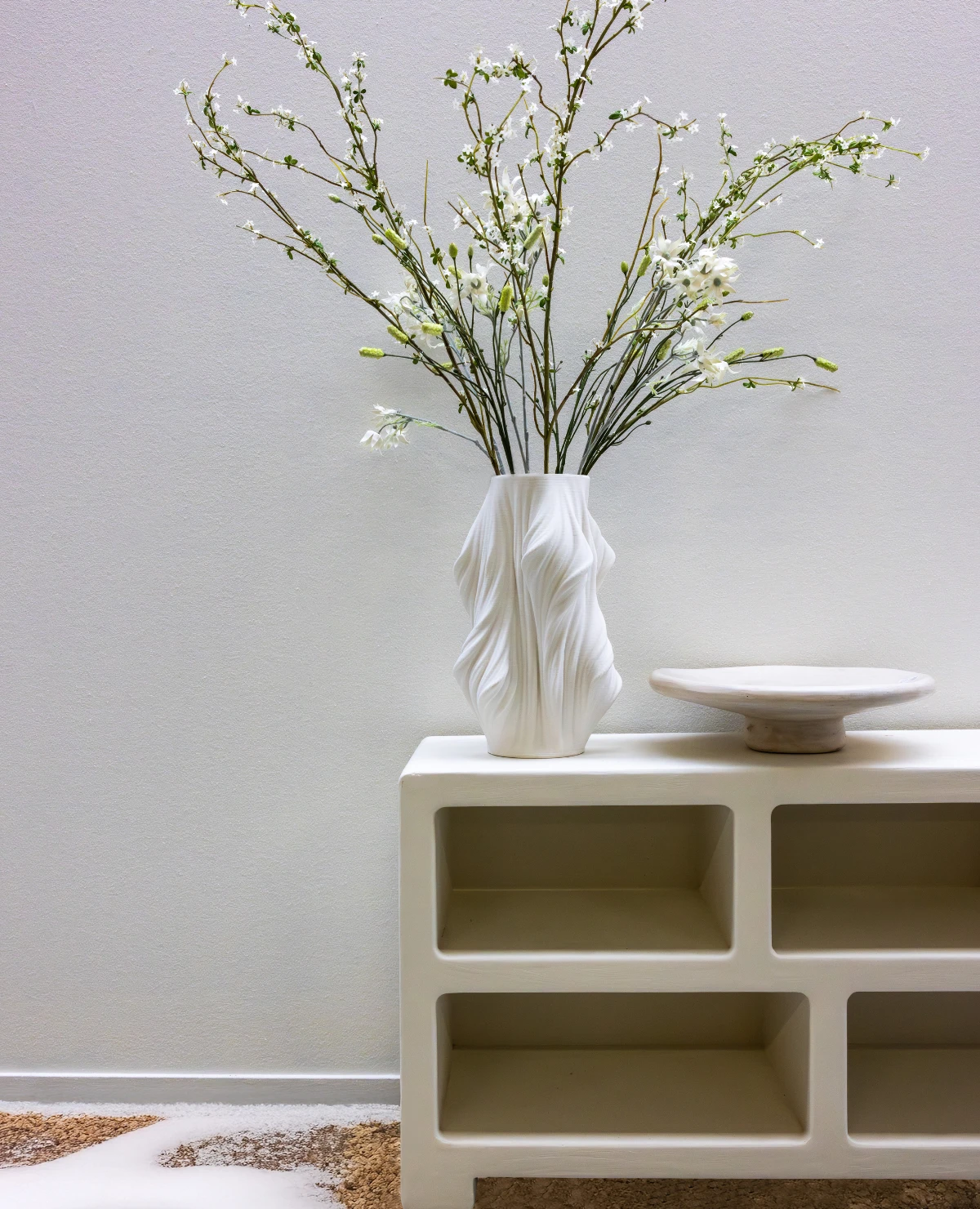
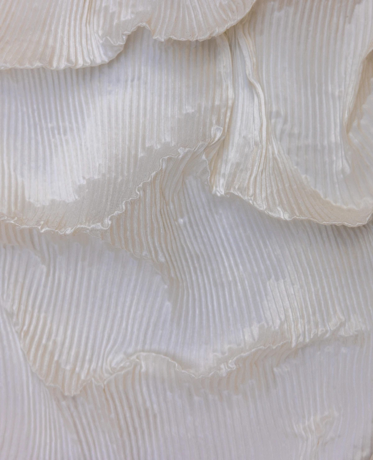
Autumn/winter 26/27 trend colors show that the focus is shifting towards peace, comfort, and refinement. The color palette consists of warm neutral tones that create a sense of security while offering space for subtle contrasts.
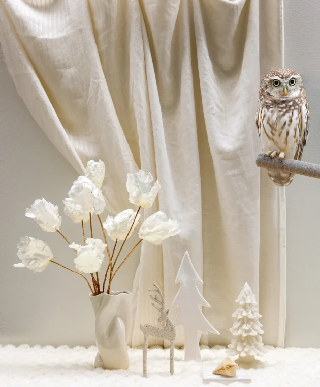
Cream, sand, warm greige, and soft green tones form a harmonious base where natural materials and organic shapes truly come into their own. The result is an interior that invites you to slow down and consciously enjoy your surroundings.
Discover the trend colors for autumn/winter 26/27 and get inspired for your next purchasing moment.
Taupe, cappuccino, and off-white form a soft base to build upon. Think of warm sand tones, cream, and greyish beige nuances that give an interior peace without feeling cool.
By combining different neutral tones, a layered interior is created that radiates warmth without becoming heavy or overwhelming.
Alongside the neutral base, there is room for soft accent colors that add depth to the interior. Think of misty green, greyed natural tones, and powdery nuances that effortlessly blend with the calm color palette.
These colors enhance the sense of balance and provide a refined look.
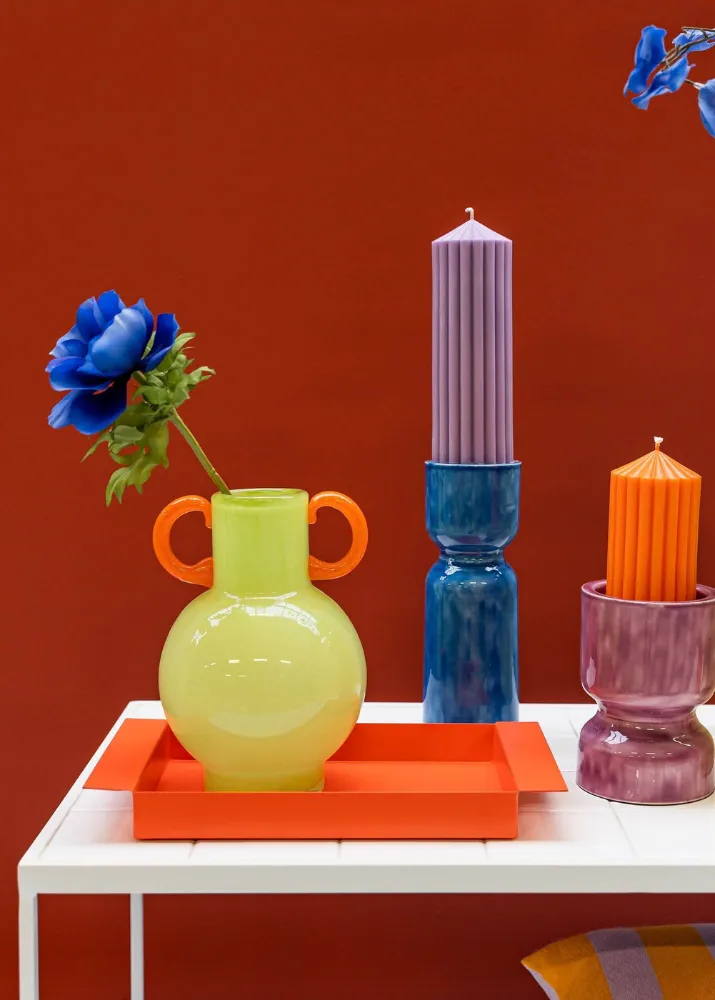
Out with the clutter and unnecessary details. Sporty Neon is all about clean lines, minimalist furniture, and smart layouts. Everything has a function and contributes to a tidy look that stimulates focus and creativity. No distractions, only room for improvement and new ideas.
Although this trend is about energy, power, and movement, comfort remains important. Soft fabrics, generous cushions, and warm textures make an interior not just stylish, but also inviting. The perfect balance between action and relaxation, ideal for busy days and moments of rest.
This spring is all about energy, comfort, and a futuristic touch. For everyone who wants to move forward, show themselves, and is always looking for new inspiration – Sporty Neon is THE trend of the moment!
This trend isn’t about strong contrasts, but about nuances. By bringing together different shades from the same color family, a calm and harmonious whole is created.
From light cream to warm sand and from soft grey to subtle green: the power lies in the layering of color.
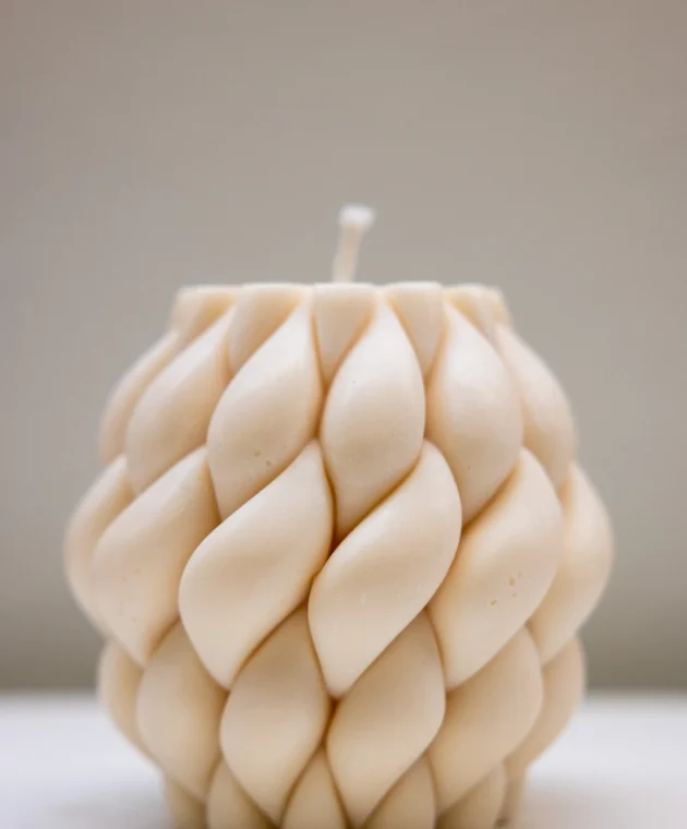
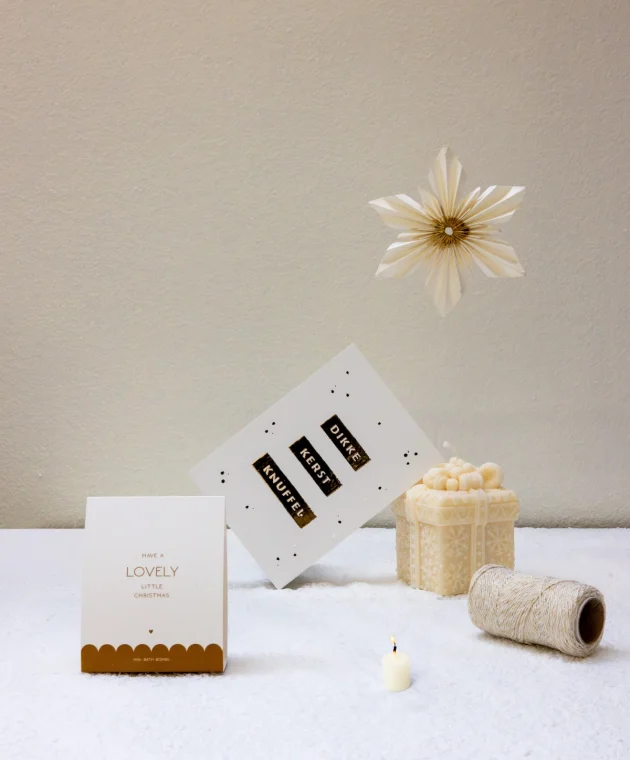
Materials play an important role in the experience of color. Linen, ceramics, cotton, and paper give neutral tones extra depth and character.
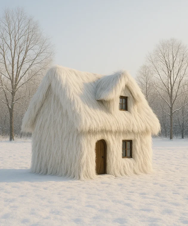
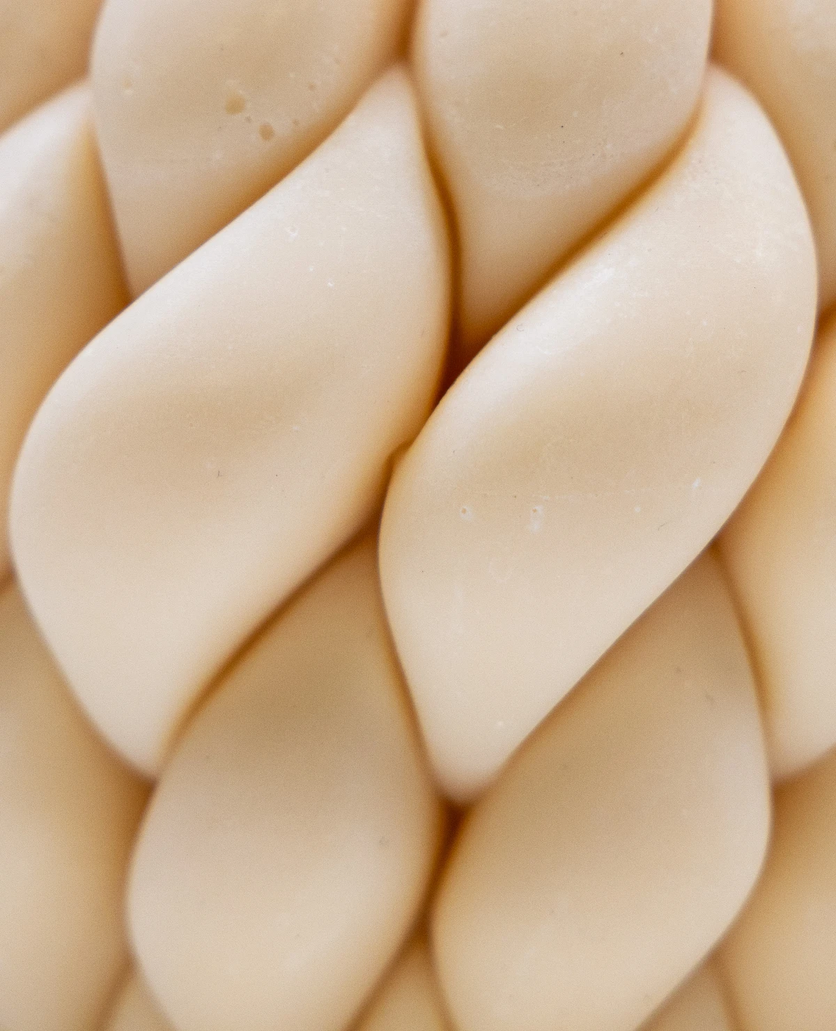
Texture ensures that soft colors remain lively and adds a sense of craftsmanship and authenticity to the interior.
The autumn/winter 26/27 trend colors show how softness, warmth, and simplicity come together in a refined interior style. The palette offers plenty of possibilities for decoration, home accessories, lighting, textiles, and styling concepts.
By carefully coordinating colors, materials, and shapes, a timeless look is created that meets the need for comfort and peace.
Get inspired at TICA by collections that translate this trend into products for every home and lifestyle environment.