The brand guide forms the basis for a consistent visual appearance of TICA. It provides guidelines for everyone working on visual communication and design, both internally and externally. TICA is for European lifestyle professionals. Entrepreneurial, inspiring, and always looking for something special. Our communication is recognizable, professional, and attention-grabbing. Always with boldness and character.
We use one logo: the TICA wordmark. In running text, TICA is always in uppercase. This keeps our brand style strong and recognizable.
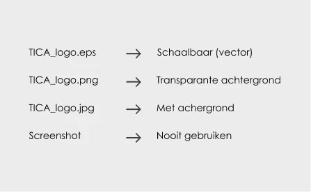
Usage Guidelines
All external communications always include the TICA logo. In-store signage also usually carries the logo. If multiple communications are placed close together, the logo doesn’t need to be repeated on every piece. Use your insights to determine what’s logical and clear.
The logo is standardly used in black or white. Only on specific occasions, such as events, promotions, extras, and internal use, may TICA blue be applied. This color usage is an exception.
Logo
Things to avoid
Do not place the logo in an unofficial form.
Never stretch or distort the logo.
Do not use an outline.
Do not use gradients or other colors.
Do not add shadows, glows, or other effects.
Do not use gradients or other colors.
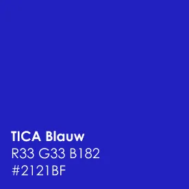
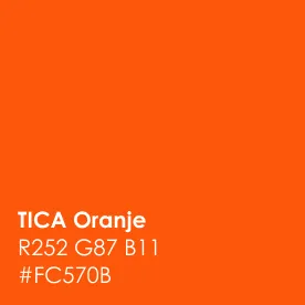
Color
TICA’s primary color palette consists of black, white, blue, and orange. Black and white form the base; they provide calmness and contrast.
Blue Blue is used sparingly. Only on specific occasions, such as events, promotions, extras, and internal use, may TICA blue be applied. This gives TICA a fresh and energetic appearance for these occasions.
Orange Orange is strategically used for important call to actions like ‘Become a TICA member’. This makes it stand out and strengthens the conversion goal. In-store routing is also orange because it needs to be noticeable.
Primary Colors
Color Usage Paint Colors
Black | general Ral 9005
White | general Ral 9016
Orange | for emphasis Histor lemonade S 0580 Y60R
Blue | events Ral 5002
Trout | general Histor Forel S 2005-Y30R
Beige | TICA Projects Natural Color System S 1505-Y30R
Typography
Font
TICA uses one typeface: Century Gothic. It comes in two styles: Regular and Bold.
Regular is the base. For body copy, individual words, or short sentences like “see more,” quotes, and slogans. Titles are also ideally written in Regular – clean and easy to read.
Use bold for subtitles, headings, or to add emphasis. This way, the typography remains recognizable, clean, and consistent across all TICA communications.
Make sure there is enough space around titles, loose words, short sentences, etc. to maintain lightness.